The adventures of hat guy and tutorial gal
Some people's names can hold up to being put in the title of a videogame or movie, but I'm not sure "Elliot" is one of them. The protagonist of Square Enix's next HD-2D game is introduced by one NPC as a man of good character, although they "will admit he has his quirks." I assume that's a reference to Elliot's red hat, which seems to be the the only notable part of his personality.
The Adventures Of Elliot: The Millennium Tales might be as bland as its main character, but I think I'm fully onboard anyway after playing its demo.
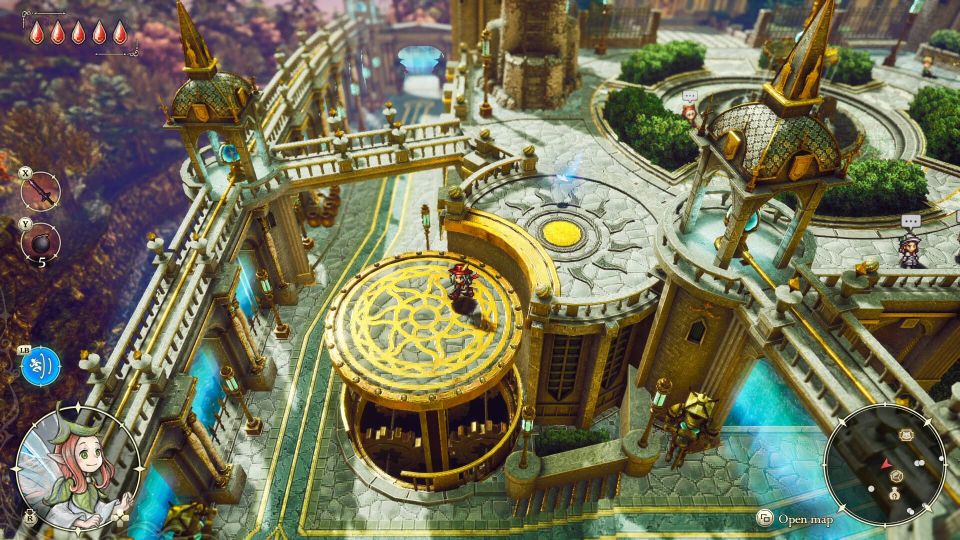
Elliot is an adventurer in a fantasy world overrun by beastmen. The remaining human population are safe inside a medieval city's walls thanks to a magical shield maintained by the princess. Adventurers are those few who travel beyond the walls to explore and find supplies, and in Elliot's case to earn money he can use to care for the children in the orphanage in which he was raised. His name could have been called Hero McDogooder and the game name would have been better.
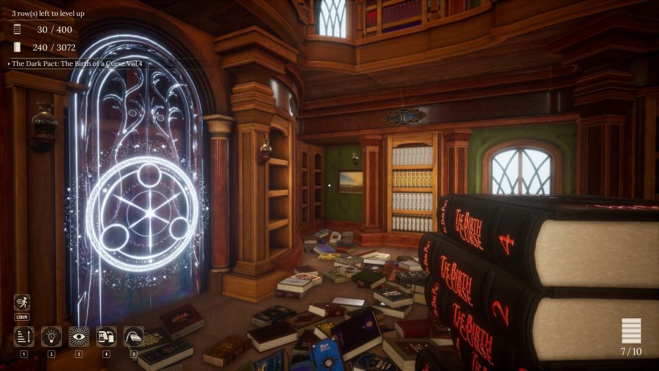
This has the same art style